
To Design front-end graphic design of the site using a responsive grid-based system
Designing the UX/UI (user experience and user interface) for all the Royal Parks sites, liaising with their internal digital team to produce a clean site, for desktop and mobile, all done in photoshop in a modified bootstrap style, Bootstrap was chosen as it’s the most popular HTML, CSS, and JS framework for developing responsive, mobile projects on the web.
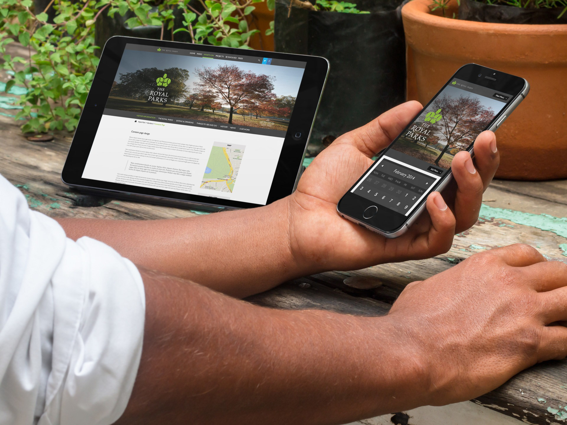
The brief was a complete refresh of all their sites, bringing in modern Internet technologies such as responsive grids, bootstrap, TTML5, GPS Google maps and hidden content on low bandwidth devices.
Content page templates
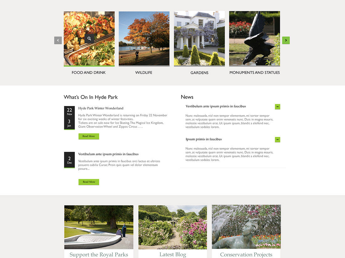
Landing page template for each park
The Royal Parks homepage design
latest news
upcoming events
blog posts
promotion of The Royal Parks Foundation
contact details
park features – e.g. cafes restaurants
gardens or sporting activities
use of Google maps for navigation/location
E-newsletter template
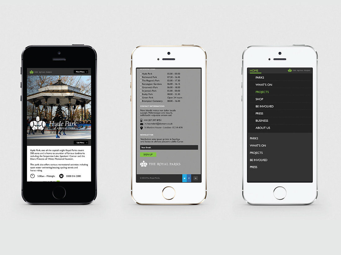
Mobile Web app (version of their full site, with button to full site)
Landing page template for each park
The Royal Parks homepage design
latest news
upcoming events
blog posts
promotion of The Royal Parks Foundation
contact details
park features – e.g. cafes restaurants
gardens or sporting activities
use of Google maps for navigation/location
E-newsletter template
Mobile Web app (version of their full site, with button to full site)
Smallest to start from 320/480 pixels wide, this should have an almost app feel, for ease of use and usability, with clean UI and a strong UX across a group of mobile devices. The amount of content will almost be the same; maybe content and images can be hidden until the user requests them for the speed of download. Use of geolocation was used to identify monuments/sculptures to coffee shops, trees and so on.

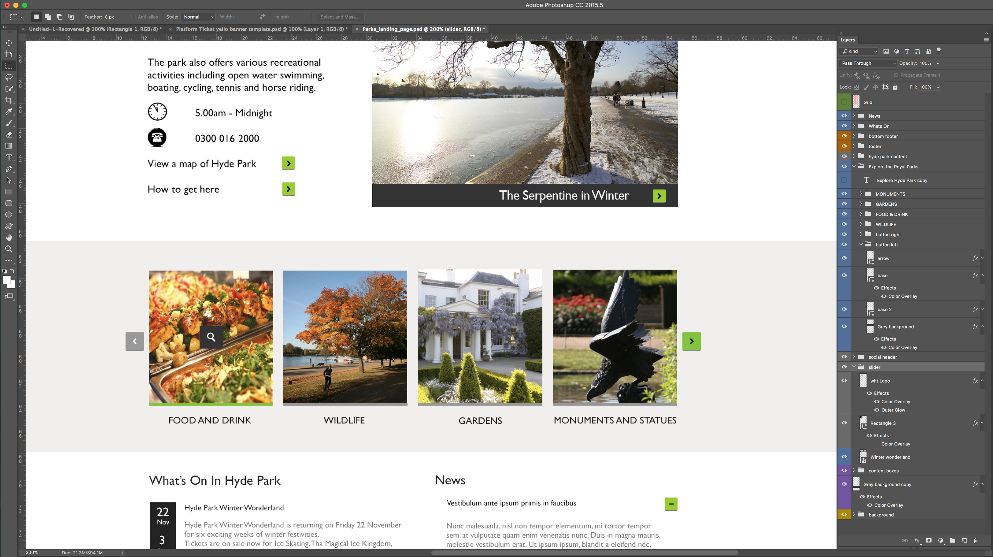
Photoshop files

Photoshop files